To begin, I want to ask you a question: how many transactional emails does your SaaS solution send per month?
Well, if you are a Postmark customer like me (we at Bybrand), it is easy to find out. Log into your customer area and look at the main menu bar, which gives a real-time display of the email volume of your account.
But why am I asking this question? Knowing this number is important to know the size of the opportunity.
Now comes the second question. Would you like your transactional email to generate more value than just essential and informative email?
If your answer is yes, read on.
The following article has been organized into three topics: what a minimalistic HTML email signature is, a use case, and – the best part – how to use it from Postmark.
Minimalist HTML email signature
Why not make every transactional email more user-friendly?
The first thing you need to remember when it comes to your email signature is consistency. The email signature you insert into your transactional emails can be similar to the one you use on your employees, while maintaining the text colors of your brand.
In a transactional email, a minimalist HTML email signature can be used for many purposes. Here, I have some good ideas for where you can use it:
- Plan expiration reminder;
- End of free trial period;
- Email to recover abandoned carts.
Password reset emails
Specifically, for our case at Bybrand, we do not add a minimalistic email signature to a “password reset” message. Because this kind of email is so specific, you don’t want to add a signature to it – usually, with this kind of message, the recipient just performs the action and deletes the email.
Use case – minimalist email signature
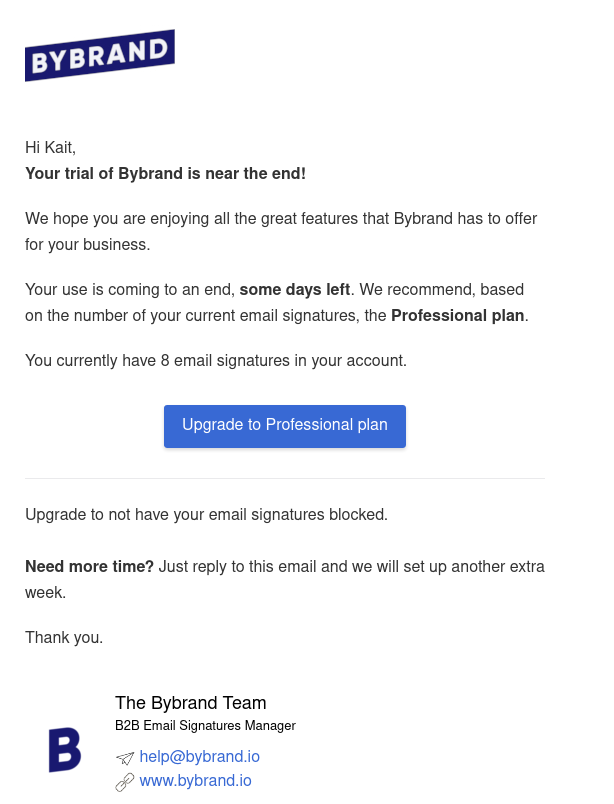
Here is an example of how we do it at Bybrand for the 30-day Free Trial reminder approaching its end.

Note that our minimalistic HTML email signature has a different logo/brand icon. We did it this way because we think it doesn’t make sense to have the same logo in the Header and the Footer of the email.
One idea might be to remove the logo from the Header and leave only the one in the signature – that is, swapping it for one with their name.
Now I’ll feed your imagination with some minimalist email signature template ideas for your next Postmark transactional emails.

This first example of ours can work very well for a transactional or follow-up email. It offers the option of a personal communication, but you can change the headshot to a logo. Notice that there is a link to the knowledge base – presumably content generation is the company’s specialty.

In our second example, we have an email signature with social media buttons and a website. This example is ideal if you want to increase user engagement. As an add-on, you can add a UTM code to the website link to track clicks within Google Analytics or Plausible Analytics.
See more examples of email signature templates here.
Avoid email signatures with plain text
To finish this topic, unlike minimalistic HTML email signatures in the examples above, some people choose to add a plain text email signature to their transactional email, for example, “Att [Your name]” or “Att. [Company]”.
This is certainly the worst use of the block at the end of a message.
If you are uncertain about the benefits (I don’t have the numbers), you might want to try it out, and switch to an HTML email signature only for a while.
Minimalist email signature in your Postmark transactional emails
At Bybrand, we started using minimalist email signatures in transactional messages 2 years ago. Although we are an email signature management software, I confess that I was not previously aware of this possibility.
What follows is a step-by-step tutorial on how to insert a minimalistic email signature into a Postmark template.
See how Postmark’s templates work here.
Postmark’s HTML template service is amazing – if you are already their customer, then you know what I’m talking about. Being so simple (I’m a techie), I don’t even think it needs a tutorial.
But let’s take a look at the steps anyway:
Steps:
- Login to your Postmark customer area.
- Go to the Servers menu, and click on the server you want to add the template to.
- Click the Templates menu.
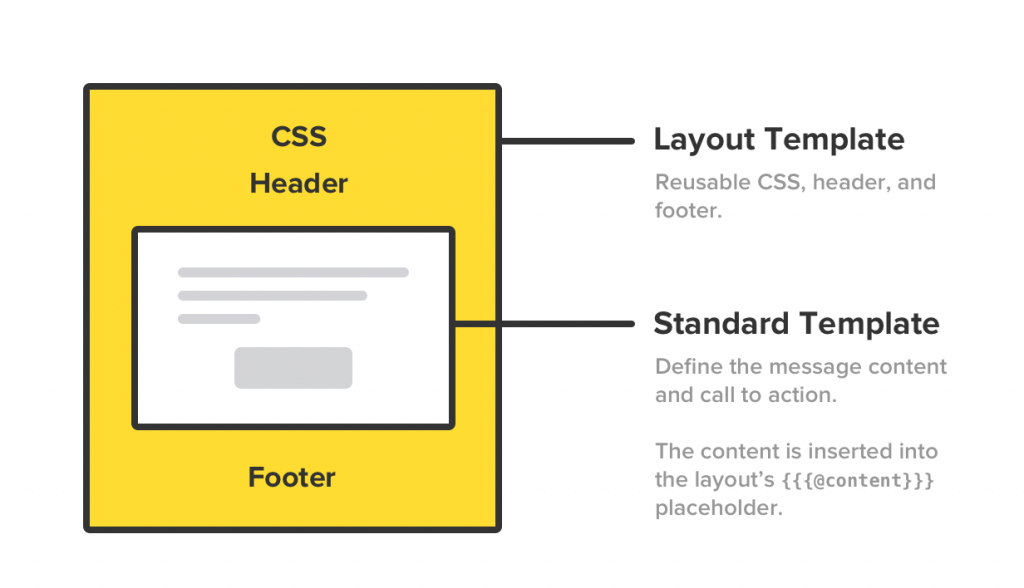
You are probably using the Layouts feature, but if not, you should. It is the fastest way to add signatures of different formats.

You will add the HTML content of the minimalist email signature to the Footer area.
Continuing…
- Visit the Layouts menu.
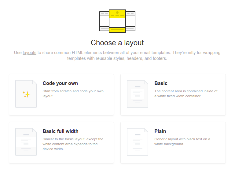
- Create a new layout or duplicate an existing one.
To simplify our example, I have created one using the Basic model, as you can see below:

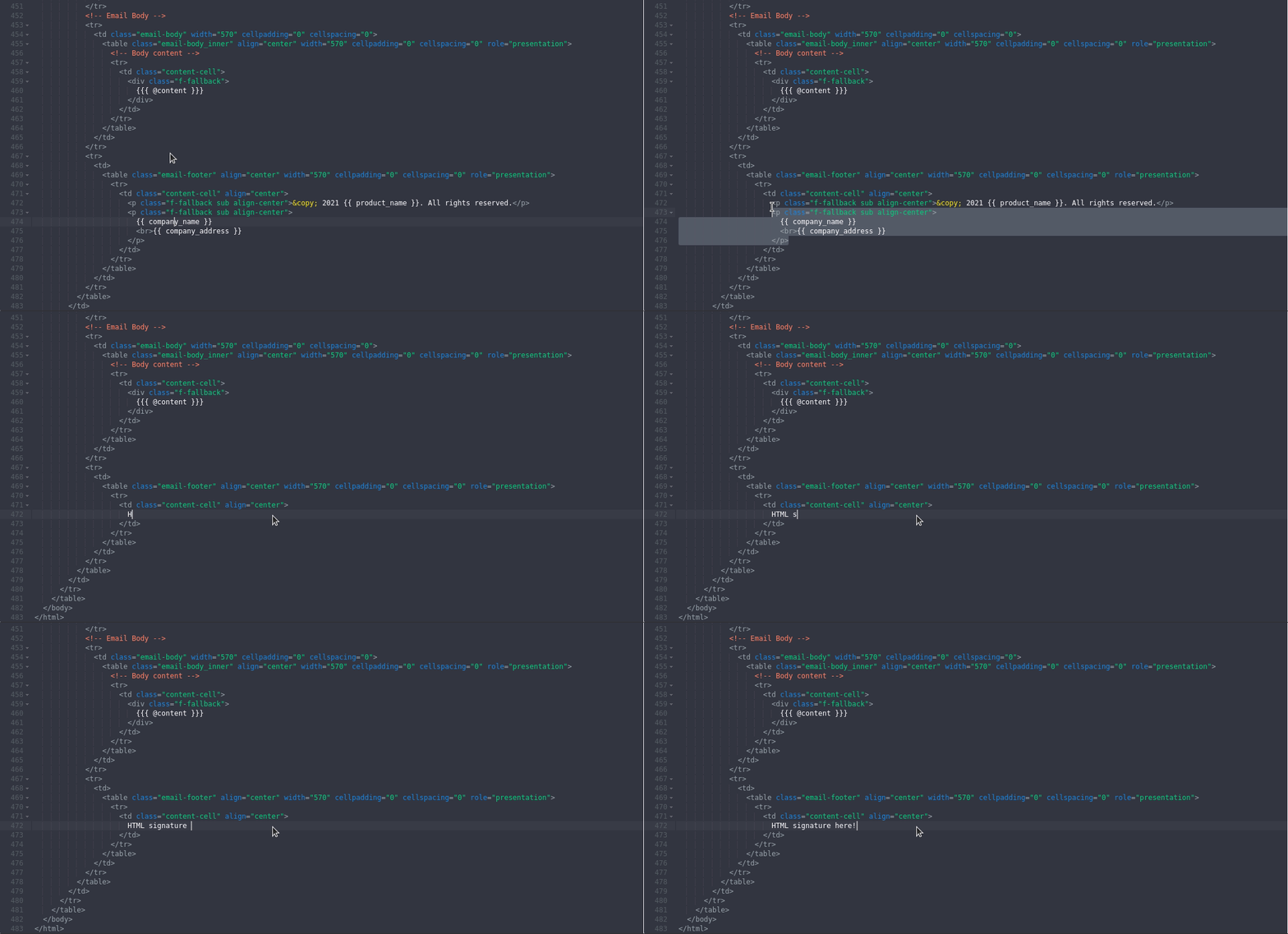
Now edit the content in HTML mode and remove the final part of the HTML table. The content of the minimalist HTML email signature should be inside the CSS class “content-cell”.
Here, I have an animation for you to better understand.

Done! Now you can preview the changes and, if everything is correct, save it!
It is a good idea to do a few test submissions before adding the layout to the production server.
Final thoughts
We know that every SaaS solution sends some type of transactional email. In this category – and note that I am not being paid to write this – Postmark provides exceptional service, offering the best delivery rate which guarantees a fast delivery to the recipient’s inbox.
If Postmark paid you 10 cents for every transactional email message that takes longer than 10 seconds to arrive in your inbox, at the end of the month, you would get nothing.
I would also like to emphasize that, with transactional email + minimalistic HTML email signatures, you will increase your brand engagement.
Don’t make the mistake of using simple email signatures (plain text), or worse, using images only.

Create your first email signature with Bybrand
Bybrand offers the ability to generate, administer, and distribute essential email signatures for your employees.