This post is also available in: Português
A professional email signature can be a powerful tool for any personal assistant. Not only does it improve your email etiquette, but it also helps you achieve more with each email you send. This could be through boosting brand recognition, scheduling meetings, sending traffic to the company website, or more.
Before you just set up any old email signature, you must choose one specifically designed for personal assistants – one that includes all of the necessary elements and information. We’ll break this down in detail in the guide below.
Elements to include in an email signature for a personal assistant
A personal assistant email signature can have a big impact on your communications, which is why you need to ensure it contains the right elements.
Here are some of the most important details to include in personal assistant email signatures:
- Professional photo: Use a high-quality, professional headshot to build trust, and recognition, and add a personal touch.
- Full name: Clearly display your full name in a larger, bold font, so contacts know who they’re communicating with.
- Job title: Clearly mention your role as a Personal Assistant and who you work for.
- Company name: Include the name of the company you work for. It’s best to add the company logo for branding.
- Phone number: Provide a direct contact number. If you have different numbers for office and mobile, include both – see how to make if here.
- Email address: List your professional email address. Make sure it’s hyperlinked for easy communication.
- Website URL: Include a link to the company’s website.
Optional elements
- Call-to-Action (CTA) link: It can be a good idea to add a call-to-action link, such as a calendar booking button for scheduling meetings.
- Social media icons: Include icons linking to the organization’s social media profiles.
- Office address: If relevant, add the complete office location. Include the street address, city, state, and ZIP code. Alternatively, this information can be replaced by a Google Maps banner (see an example below)
It’s important to note that not all executive assistant email signatures need to look the same and include each of these elements. Some email signatures may also include other elements, such as a legal disclaimer.
Using an email signature manager with personal assistant email signature templates is the best option, as this ensures the signature looks professional while including all the necessary information.
Design tips for an effective email signature
There’s a lot that can go into creating a personal assistant email signature. Here are a few things to keep in mind to help you incorporate all the essential elements into a professional email signature.
Keep it simple
A clean and simple layout is key.
Avoid clutter by including only the key elements and necessary information. This makes your signature easier to read and a lot more visually appealing when it’s part of your email communications.
A simple email signature design also helps any CTAs stand out, which will generally boost engagement with your signature.
Pay attention to your font
Stick to one or two font styles so that it’s easier to read.
Examples:
- Arial
- Calibri
- Helvetica
These options are clean and professional and work well with any email client. Using multiple fonts can make your signature look messy and unprofessional.
You’ll also want to choose a font size that’s easy to read on both desktop and mobile devices. Typically, a size between 12 and 14 points works well.
Use consistent colors
Use colors that match your company’s branding. Limit your palette to two or three colors to maintain a professional look.
Use icons
Icons for phone, email, and social media links make your signature more visually appealing and easy to navigate.
Small, consistent icons help to break up text and guide the reader’s eye to important information. This is far more effective than hyperlinking over text.
Test your signature on different devices
Ensure your email signature looks good on both desktop and mobile devices.
Different email clients can display signatures differently, so testing it out ensures consistency across platforms. This is an important step to take before making your signature live.
Keep the image sizes small
An essential element of email signature design is making sure the signature can load easily on different email clients. One of the best ways to optimize this is by reducing any image sizes.
This also keeps your emails quick to load and reduces the risk of them being marked as spam.
Use HTML over image-only signatures
While it might be tempting to design an image to use as an email signature (like a Canva email signature), this won’t do your email communications any favors.
Sometimes images don’t load properly, and you can’t include multiple clickable elements into them. Instead, use email signature software that allows you to create an HTML signature. This will help your signature be far more engaging and effective.
Email signatures examples designed for personal assistants
Ready to create an email signature? Take a look at some of these email templates and examples to inspire yours.
Sales assistant
An email signature for a sales assistant should be attractive and functional, highlighting quick contact information (phone, email). The goal is to encourage scheduling meetings or direct the prospect to sales opportunities.

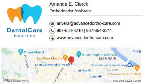
Example for a dentist assistant
The email signature for a dental assistant needs to convey trust and accessibility, including essential information for scheduling appointments and highlighting the name of the clinic to reinforce patient trust.
In this example, we added a banner on Google Maps, see how to do it here.

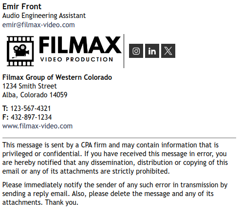
Template for audio assistant
An HTML email signature for an audio assistant should be creative and technical, incorporating direct links to the website and social media channels to showcase the jobs.

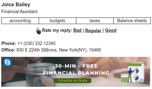
Financial assistant
For a financial assistant, the HTML signature should reflect accuracy and professionalism. Clearly highlight areas of expertise. Also consider including a banner for easier appointment scheduling.

HTML signature for a paralegal
This last example is an HTML signature with only text and links. A paralegal’s email signature should be formal and understated, with an emphasis on contact details and a disclaimer to ensure that communications remain within ethical parameters.

Additional considerations
Creating an impactful email signature for a personal assistant involves knowing what to include and what to avoid.
Here are some extra considerations on what not to do.
Too much detail
Including too much information can overwhelm the reader and detract from your email signature. Stick to the essential details and only include information if it will enhance your communications.
Long quotes or messages
Avoid adding long quotes or personal messages to your email signature, as they can make your signature look cluttered and unprofessional. If you include a quote, keep it short and relevant to your work ethic and brand identity.
Inappropriate photos
Ensure any photo you use for email correspondence is professional. Avoid casual, holiday, or party photos. Stick to a formal headshot that reflects your professional image. After all, you’re not only representing your organization, but you’re also representing your personal brand.
Large graphics
Any overly large images or flashy graphics can distract from the content of your email. This will result in your email signature being ignored, instead of engaged with.
Keep any images small and relevant to your organization. The best way to design your signature is to use a template specifically made for personal assistants. This way, you know that the signature will include all necessary design elements in a professional manner.
Complex formatting
Complex formatting, like multiple columns or tables, can break when viewed on different devices. We can’t stress this enough – keep your layout simple and straightforward.
Including too many links
Including too many links can make your email signature look cluttered. This also makes it difficult for recipients to decide where to click, which generally results in no clicks at all.
Stick to the most important links, such as your email, phone number, and one or two social media profiles.
Personal information
Make sure you don’t include personal information, such as your personal phone number. This is both unprofessional and can compromise the privacy of your sensitive information.
Conclusion
Setting up an email signature might seem straightforward, but you need to make sure you include all of the right details and elements for your personal assistant signature to be effective.
Understand what you aim to achieve with the email signature, and who will be receiving your emails. This will help you include all of the most important elements and details for optimal performance.
Using an email signature management tool that comes equipped with templates for personal assistants is incredibly valuable here. This allows you to easily create a professional signature that includes every important detail.

Create your first email signature with Bybrand
Bybrand offers the ability to generate, administer, and distribute essential email signatures for your employees.