This post is also available in: Português
When you think about branding efforts, email might not be the first thing that comes to mind. If you’re overlooking the power of email as a branding tool, you’re missing out on a prospective opportunity. 188 billion emails are being sent daily, now think about how many you sent just last week alone, and think about how much time that equates to.
This is why it’s so essential to build a professional email signature, as each and every single one of your outbound emails is an opportunity to promote your brand. It’s really baffling to us why so many businesses still use sloppy email signatures; they’re leaving so much out on the table!
To avoid falling into the same traps as these businesses, you’ll want to avoid these five most common email signatures mistakes.
1. Too much contact information
If you’re sending a company email, you only need to include one or two contacts, and not anymore. Think about it. You need the name, position, email, mobile phone number, business number, and maybe the address of your business.
That’s already a lot to take in by itself, imagine yourself as the receiver who has to go through 5 more of those. It can seem redundant and confusing and turn your potential customers off from your brand.
2. Not designing for mobile devices
More and more people are checking their emails from their mobile devices, and you need to accommodate their browsing behavior instead of working against it.
If the links on your professional email signatures are so tiny that the receivers can’t tap on them accurately, it creates a bad user experience that will affect the overall impression of the brand. We suggest you use a font size of around 11 to 14. These font sizes are usually compatible with any font and readable on any device.
Therefore, the 320px wide email signature is excellent for the mobile platform, take a look at this example.
3. Having irrelevant/outdated content
Due to the limited space on the email signature block, you should only include the necessary information and content. If you load your signature block with a ton of irrelevant or outdated links, people are just going to get confused and frustrated when they click on them. This makes the overall email feels unprofessional and unfocused.
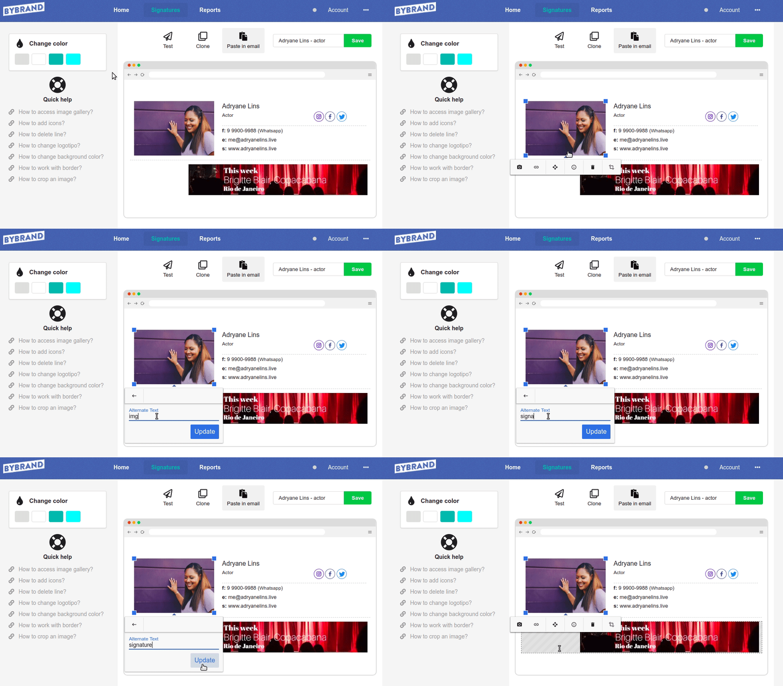
4. Not using ALT-Text
Even though it’s already 2018, you still have to make sure that your photos are readable on any device. ALT-Text is the description that the users can see when they hover the cursor over the image. You can include the necessary detail to make sure that people know what they’re looking at.
But in the email signature? Yes, some email clients do the image lock at first. Having an ALT-Tex can make it easier for your client to identify the email signature.

Tip: How to add ALT-Tex using the email signature editor of Bybrand.
5. Not adding an email disclaimer
If there’s any necessary disclaimer that needs to be included, you can put it in the signature block. In some countries, especially in North America and Europe, legal disclaimers are not required by law to be included in the emails. You must make sure that you’re abiding by the email laws of your country.
Final tips:

Create your first email signature with Bybrand
Bybrand offers the ability to generate, administer, and distribute essential email signatures for your employees.

