This post is also available in: Português
Almost 90% of users have some form of email signature for business and professional messages sent out daily. This covers everything from a simple question to an e-commerce online shop about anticipated shipping costs to a B2B communication about onboarding a new freelance team for software development.
With so much inter-business communication happening at such a rapid pace, clear contact points that ensure quality responses and information acquisition are crucial. Simply put, you want the right people to know how to find you when they need additional help.
That is where a plain text email signature can help.
What is a basic email signature?
As the name suggests, a basic email signature uses nothing more than the simple text required to get in touch with your employees. The idea behind a plain text email signature is to eliminate the added images, layout aesthetics (lines, patterns, etc.), and other items that may distract from the critical contact and identifying information.
Plain text email signature example:
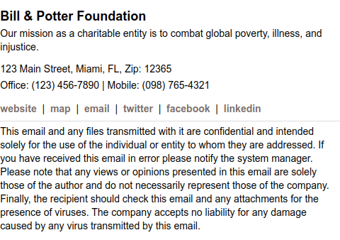
That doesn’t mean you reduce what is present as far as crucial information. You still would include your name, address, phone, email, social media, and other factors, but with text – not images or hard-to-understand formatting.
Best practices for plain text email signatures
When you streamline your communication, you increase the response rate because readers do not get overwhelmed by what is in front of them. The most important parts of a plain text email signature are the name, contact data, links to relevant resources, and text.
You would rather not use hard-to-read text (i.e., complex fonts that are too small or large). Stick to what you would read in a standard Word document regarding size and font. Don’t overcomplicate it with images or tables. This text email signature should be just that – text only!
A good starting point would be to use Arial or Times New Roman in sizes between 10 and 14 for the font.
Internal communication
A basic signature can also be used very well in internal communication between team members. This way, it is easy to identify the department the employee works in. Imagine the convenience! If you recently switched sector, other team members may automatically see this in your email.
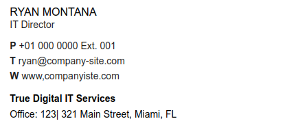
Therefore, a basic email signature has the potential to improve the way we communicate internally within the company.
Pros and Cons
Below, we’ll list the pros and cons of using a basic text-only signature.
Pros of a basic email signature
- Compatibility: The beauty of a text-only email signature is you don’t have to worry about different scripting languages getting in the way of clear and clean communication. Text is a “universal” language. Using just text reduces the chance of signatures appearing oddly shaped or missing key elements, as would happen with images or graphics.
- Consistency: With so many people using a growing variety of devices (iPhone, Android, PC, Mac, etc.) across a changing software platform (Gmail, Outlook, iCloud, etc.), text email signatures ensure consistency, so your signature is readable.
- Fast Loading Times: Without larger graphics and images to load, your text-only email signature is sure to pop up quickly in a message.
- Professionalism: Text-only signatures are easier to unify your branding. Respondents will appreciate this universal brand identity that may be interpreted as additional professionalism on your part.
- Accessibility: An often-overlooked aspect of anything digital-related is accessibility. You want readers with visual impairments or who rely on screen readers to also understand your text-only email signatures.
Cons of using a basic email signature
- Visual Appeal: We live in a visually aesthetic-focused world, where images and video garner more attention than text. Not having a company logo or brand colors (Although you can add color to the text) could harm your ability to leave a lasting impression.
- Fewer Interactive Elements: Text is just that – only text. There are no fun social media profile icons or promotional coupons you attach to the email signature. That could lower response rates from people seeking fun and interactive elements.
- CTA Effectiveness: Every email should have a CTA, even if it to respond to the sender. Without visual aids, you decrease the types of CTAs you can include, like “Buy Now” or “Click Here to Sign Up for Newsletter.”
- Tracking Restrictions: For data analytics, a plain text email signature doesn’t include clicks you can monitor. These are frequently used to measure open rates, CTR, and other data-driven insights for future decision-making.
Steps to create a basic email signature using a template
Weighing the various pros and cons of crafting a unique text-only email signature for your company is entirely up to your team. However, actually building the signature takes minimal effort once inside your Bybrand dashboard.
Here are the general steps you may take to get started:
- Click on Create from a Template under Email Signature.
- In the list of template options, select Text-only.
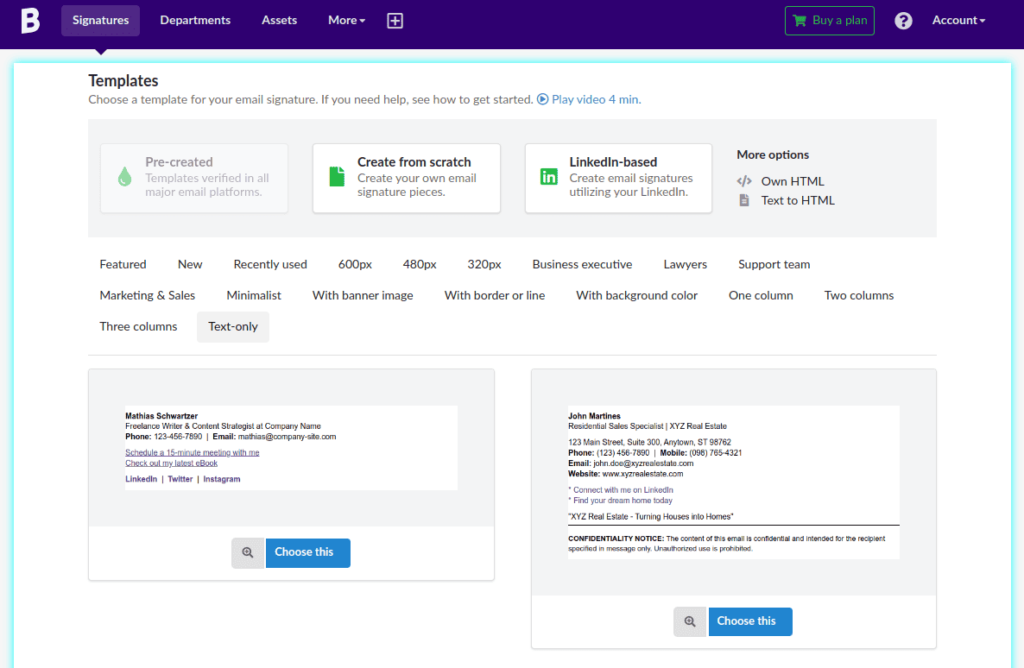
- Look through the various templates available and select the one most aligned with your goals.
- Click on Choose This.
- Go through and select the various elements inside the plain text email signature to update your current content information and links.
- Format according to your needs and give the new email signature a name before saving.
- You can “Test” your email signature to see how it appears on various-sized screens.
- Once finished, you can Download or Clone the basic email signature for use by other team members or for later on.
Here’s a quick video of all the steps above:
As an added suggestion, you may want to save the title using a phrase that identifies it as using only plain text. Something like “Text only” to the end of the name may be appropriate so other team members using your Bybrand dashboard will be able to pick out the pre-create template for future use.
Examples of effective plain text email signatures
Even though you are focusing on a basic email signature, you don’t have to sacrifice fun layouts or interesting formatting that emphasizes certain aspects, like email or social media links. The goal is to make them universally accepted and easy to read.
For example, this email signature under Mathia Schwartzer provides vital information like who the person is, how to reach them, social media links, and a CTA for both a meeting and an eBook. This showcases how easy it is to keep a reader’s attention while getting the promotional benefits you may wish to receive.

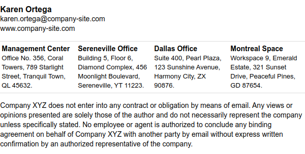
Our Karen Ortega example also demonstrates how fluid you can make a plain text email signature example. Here, you have the crucial name, company, and primary contact info, but then you can still separate out remote office locations. Even better, there is a “disclosure” at the end to indemnify the company.
The email signature below includes direct elements of internal communication (phone and email) as well as social media options, offering various ways to get in touch via other employees.

Finally, look at Jessica Jones. In this example, you can see a fun part of plain text email signatures that doesn’t get a lot of attention – color and formatting. The bolded items emphasize the importance, and the unique color differentiates the signature from the many others in a respondent’s inbox.

Conclusion
Anyone seeking a simplified tool to ensure employees receive a professional, easy-to-read, and straightforward signature should seek a text email option. This eliminates the need-to-know coding like HTML and reduces the overall size of the email by taking away images, graphics, and videos.

Create your first email signature with Bybrand
Bybrand offers the ability to generate, administer, and distribute essential email signatures for your employees.