This post is also available in: Português Español Deutsch
Creating engaging email communication requires more than sending out cold messages and hoping for the best. Clients, stakeholders, peers, and team members must all know how to best reach you at any time. That means having a unified mobile email signature that everyone representing your brand can leverage.
In today’s incredibly fast-paced online environment, mobile devices have become the primary resource for all points of communication. According to Litmus, up to 49.7% of email opens occur on mobile devices. If you have not yet optimized your mobile email signature templates to meet this growing demand, you risk losing out on lead generation and client communication.
A well-designed mobile email signature will not only leave a fantastic lasting impression on your target audience, but also enhance your brand reputation. Learning how to introduce easy-to-follow templates will ensure you get the quality communication needed to grow and expand your business.
Why mobile email signature templates matter
Having universal mobile email signature examples is crucial to ensure that your brand’s communication looks visually appealing and remains functional. Due to the limited space, it must be designed carefully to look presentable on mobile device screens.
So, a well-crafted template helps conveys your critical information in a concise manner while maintaining a professional aesthetic.
Adopting a mobile-optimized template can boost your customer engagement and leave a positive impression on anyone who receives your emails through their iPhone, Android, Samsung, or tablet-sized device.
Given that more than 99% of consumers check their emails daily, it only makes sense to feature your contact information for their preferred devices.
Tips for creating a mobile-friendly email signature
Getting started with solid mobile email signature templates doesn’t have to be a massive challenge for you or your marketing/IT departments. Keep these tips in mind:
- Keep it simple – Remember that mobile screens have limited space (Usually a maximum of 320px wide). Keep your signature brief and present only the critical information your target audience needs.
- Use clear fonts – Choose fonts that are easy to read on small screens to ensure quality readability.
- Include necessary contact details – Be sure to have your name, job title, company/brand name, phone number, clickable email address, and web address for anyone to read.
- Integrate social media icons – Over 4.48 billion people worldwide rely on social media. Be sure to put clickable icons or links to your primary social media accounts in your mobile email signature.
- Optimize your design – Keep a clean, visually appealing, mobile responsive design that cuts way down on clutter or extensive graphics.
Common mistakes to avoid
Learning to craft a mobile email signature for the first time can seem overwhelming but, with a bit of practice, you can easily create a robust online representation. However, there are some essential tips to follow to avoid common mistakes:
- Using personal images – You want a professional presentation. Keep your photos aligned with your brand identity, so you aren’t including a picture of you with your dog at a BBQ when addressing pro clients.
- Attempting too much humor – Humor is subjective. What is funny to you may be highly offensive to someone else. Keep things simple and professional.
- Not checking for broken links – Quality mobile email signature templates should have active links to your social media, email, phone, and other contact information. If those links are broken, you might as well not include the template at all.
- Avoid indicating “best with” notes – You shouldn’t have to say “best viewed on iPhone” or something similar. Your email signature should already be optimized for all devices.
- Don’t contact stuff – Keep your details simple and easy to read, so your target audience doesn’t get lost in a sea of contact information.
Top mobile email signature templates
To help you in your journey of creating a professional mobile email signature template, check out these examples of visually appealing and mobile-friendly designs that incorporate all the features suggested in this article.
1 – Two-tone elegant

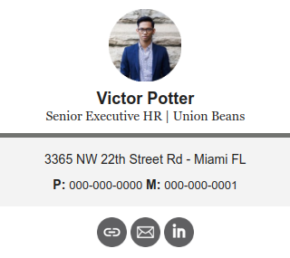
This horizontal email signature template features a simple professional photo on top and allows the reader to view your name, title, company, and contact information. The design is elegant, with a two-tone separator and relevant links at the bottom that show up well on a mobile device.
2 – Simple professional template

This minimalistic mobile email signature displays information in a simple but effective way. It feels like a standard signature after a letter, with a subtle CTA for booking and a company logo that boosts professionalism.
3 – Name & photo template

Even though the name in this signature is in a unique font, that doesn’t distract from the rest of the information and looks good on a smaller screen. The written contact data is short, and the picture does most of the talking for you.
4 – Horizontal two-tone template

Similar to the first example, two colors separate the information without distracting the reader. The data is clearly outlined and is free from complex photos or graphics that would clutter a smaller screen.
5 – Clean layout template

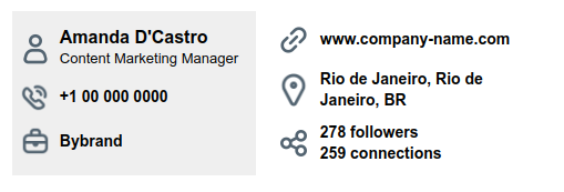
This is the perfect solution for those who prefer email signature templates without complex designs. All fonts are easy to read on any screen size and the formatting looks clean. The social icons are black and white with recognized graphics that any modern reader would understand.
Creating your first mobile email signature
When deciding on how to formulate your first set of mobile email signature examples, you can either choose from the suggested templates on a website like ours at Bybrand, or you create an email signature from scratch.
Video: How to create a responsive email signature for iPhone with Bybrand.
The template route is more accessible because they’re all already optimized for mobile devices. This will require much less A/B testing to ensure your signature shows up correctly on the device your target audience uses the most.
However, once you are familiar with how to use templates, you can easily create your own templates from scratch. Because most mobile devices have a default signature (for example, iPhones say “Sent from my iPhone”), you want to change to an HTML or mobile-friendly version quickly to avoid brand or communication errors.
How to remove the “Sent from my device” signature on the iPhone
https://www.bybrand.io/blog/iphone-remove-default-signature/
Final thoughts
Optimizing your mobile email signature templates is a must for any brand operating in the online space. You must utilize mobile-ready examples that cut down on any clutter, misunderstandings, or risk your team losing valuable leads that can boost your business growth.
By utilizing a mobile template that adheres to best practices and avoids those common mistakes, you craft a visually attractive solution that elevates your communication.
If this whole process still feels time-consuming or daunting, rely on the experts at Bybrand. Our mobile templates create a universal brand identity for your business through responsive design that ensures solid displays of your contact information.

Create your first email signature with Bybrand
Bybrand offers the ability to generate, administer, and distribute essential email signatures for your employees.